Data Visualization is part of the storytelling in the Data Journalism-Workflow. As the word storytelling already suggests, visualizations should be able to tell a story on their own. They can be an easy and powerful way to get the main message of your story across, if you keep a few things in mind:
What is Good Data Visualization?
1. Good Graphics are Necessary Graphics
Before you create a fancy visualization ask yourself: Will the visualization provide an additional benefit to your story and does it convey more or better information, than simply putting your findings into written word? If the answer to both of these questions is no, your story might work well without a visualization.
2. Visualizations will Expose Weaknesses
If you did not clean up your data properly, if your data is in different units that are not suitable for comparison or if data is missing – visualizing your data will expose these weaknesses. Make sure through every step of your workflow to pay attention to the details. It will save you from patching up holes when you are almost ready to publish.
3. One Graph two Goals
A visualization in a data story must fulfill two goals and cater two to different kinds of audiences. First, it should be easy enough to be understood at a glance and get the main message across to readers who are in a hurry. Second, it should offer more information and the opportunity to draw their own conclusions for interested readers who take the time to inspect a graph more closely.
4. Colors Matter
The choice of colors in visualizations is a topic that whole books are dedicated to. If you don’t want to get into it too deeply, keep the following tips in mind:
- Choose colors that even color-blind people can distinguish
- Be aware of the emotions and associations connected with certain colors. For example green = yes, red = no. People associate certain things with certain colors. It would be weird to visualize a graphic related to water with the color brown. Only if the brown color of water is somehow connected to the message of your story, should you make the conscious choice for a counterintuitive color.
- Avoid flashy neon-colors. These ultra bright colors will attract attention, but they will also be stressful for your audience and not very nice to look at.
Read more about how to choose the right colors for your visualizations here.
5. Less is more
Just because the internet and that easy visualization tool make it possible to put ALL the information in a graph, doesn’t mean you should. Contrarily, you should focus on the main message you want to convey with your visualization. Ditch everything that doesn’t help getting that message across.
But despite the virtues of minimalism in data visualization, make sure that the following information is kept, at least in a byline: the source of the data, the units of your data, relevant dates and the name of the visualization tool, if you used one.
Different Visualizations:
Here is an overview of simple graphs that visualize different kinds of data. They are very basic illustrations of different kinds of opportunities for data visualization.
Development over Time:
This is a simple visualization of the number of doctors in a fictional city over the years. Such simple line-plots make changes over time visible at once. If you add another line for a second city you could even compare the developments.
Proportion:
Proportions and Percentages are parts of a bigger piece. Pie Charts are good graphical solutions for that. They show right away how big for example a party's share of the votes ist.
Frequency:
If you want to illustrate how often things occur - for example different kinds of traffic accidents - you could also opt for a pie chart. But
Maps:
Maps are useful to illustrate Data related to locations. The map above shows how many Fellows of the Adenauer Media Fellowship have come from which country and the density is indicated by color-coding. Tools like Datawrapper, which we introduce to you in the next section, make it really easy to build such maps. No coding or illustrating skills are necessary.
Get creative:
Datavisualization offers endless opportunities and you don’t have to stick to classical diagrams. The examples below illustrate that thinking outside of the box can result in amazon illustrations. The following examples from various Twitter accounts show unusual visualizations and visualizations of unusual data for inspiration.
What does noise look like in some of the biggest, most crowded cities? @_wearepossible has visualised sound in New York, Paris & London in this piece about how exposure city sounds affect us. Best to wear headphones with this one! https://t.co/2SDB2PjgaB #datajournalism #dataviz pic.twitter.com/D6X0p6eKPk
— DataJournalism.com (@datajournalism) June 30, 2022
Piero della Francesca’s works — my latest data visualization designed for @La_Lettura: https://t.co/btAWL0beDh#Datavisualization #dataviz #infographic #ddj pic.twitter.com/8baKY2Kghn
— Federica Fragapane (@fedfragapane) January 21, 2022
Our time lapse based on data from @flightradar24 shows how Corona "swept empty" the sky. Even now in August there is still much less air traffic than before the outbreak of the pandemic. #ddj #dataviz https://t.co/B4FwbCyH63 pic.twitter.com/BYzvjx3Jog
— Sascha Venohr (@venohr) August 18, 2020
Free Tools to Visualize Your Data:
Vou can use a sheet program like Excel to make simple diagrams and visualization, but the minute you want something a bit more fancy, there are better options. Non-programming web-services offer the opportunity to upload your data (usually as csv-files) and choose from different, adaptable templates to make great visualizations. We recommend the following tools:
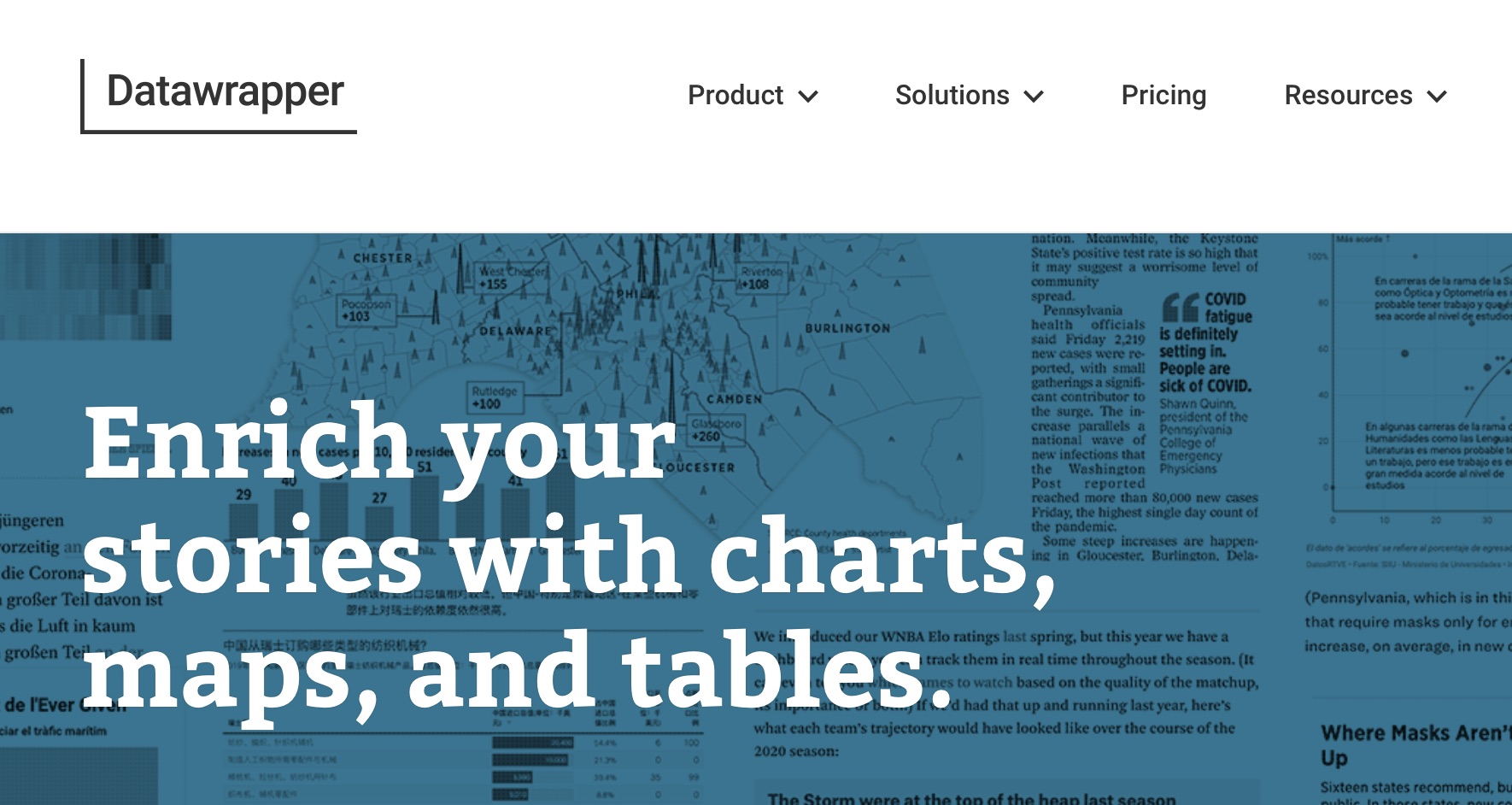
A really easy tool, where you upload your data and can then choose from different types of charts and graphics. Even in the free version Datawrapper comes with a lot of options to customize your designs. If you are familiar with basic HTML you can make your graphs even more unique. Additional, Datawrapper provides a free online-academy where you can learn about different graphs and their applicability as well as a blog to keep up with Datawrapper updates and the latest trends and developments in data visualization.
(“Datawrapper Website Screenshot.jpg”)
It works similarly to Datawrapper but has a lot more options for interactive charts and graphs. Datamatic does not offer as many free designs as Datawrapper, but its different payment plans come at very affordable prices ranging from 10 to a maximum of 85 $ per month.
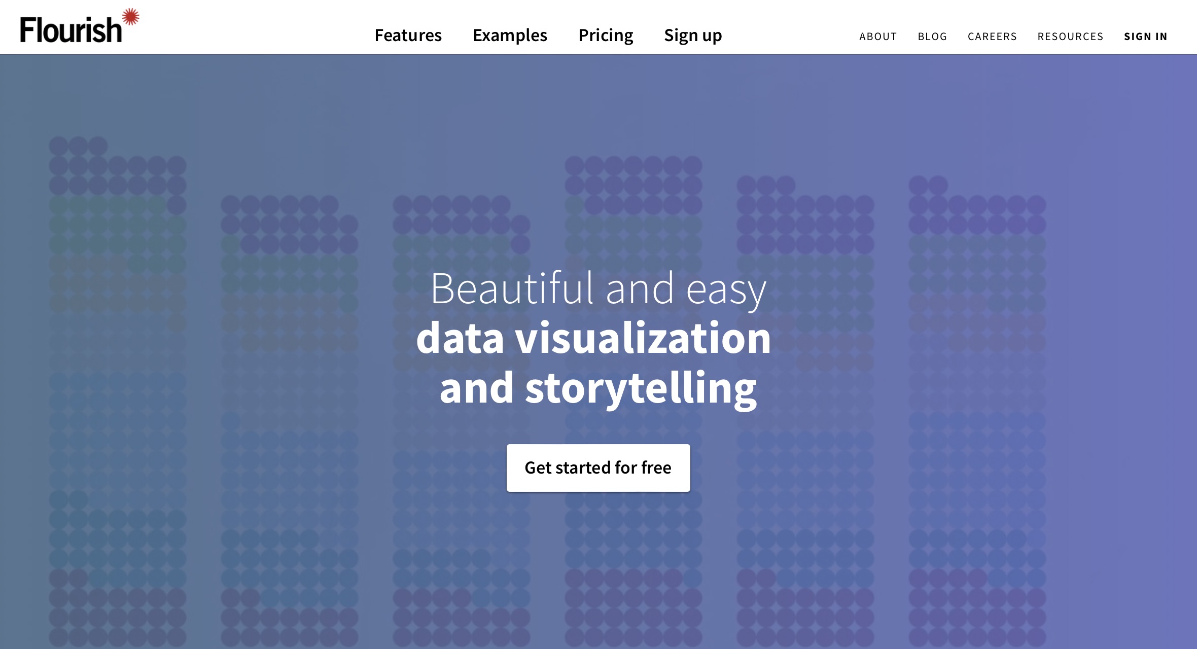
Flourish combines interactive template options with highly customisable designs and even options for animated slide shows and works very well for “scrollytelling”. Its strength is less a clear, minimalistic design like Datawrapper but rather the option to create more unconventional, animated graphs. To use Flourish for free you need to create an account but then you can get started.
Their free options are extensive but they don’t disclose the prices for their premium services on the website. At the same time they claim to offer special prices for newsrooms.